Abundance
A seasonal print magazine celebrating urban homesteading in the Pacific Northwest
Roles
Brand Design
Print Layout
Typography
Illustration
Tools
InDesign
Procreate
Illustrator
Photoshop
Timeline: 11 weeks
Team: Solo project
-
Farmers’ Almanacs have historically been a best-selling resource and classic part of the American experience, but their traditional content and style has become outdated and stale for today’s diverse audiences. Despite this, interest in DIY culture, and sustainable living is as high as ever and is continuing to grow, especially in urban and suburban communities. How can we create a magazine that transforms the historical concept of a farmers’ almanac into a thoughtful resource that is relevant for modern, progressive readers, creative makers, and urban homesteaders?
-
Abundance uses rich, saturated color, textured close-up photography, brushed display type, and a simple sketched illustration style to achieve the handcrafted feel that its readers value. Its content combines reflective and inspirational articles with an assortment of guides and resources for DIY projects that are possible in small spaces and in an urban setting.
Design
The Autumn edition of Abundance is 92 pages long with 6 feature articles and numerous recipes and project plans. The visual design combines Abundance’s signature sunshine yellow with a dark, rich palette to emphasize the coziness of the harvest season, and a hand-touched look speaks to the readers’ interests in handmade, DIY solutions. Photography focuses on texture and close-ups, connecting with the constraints of an audience that primarily lives in small urban spaces, and content is curated to be beginner-friendly but still advanced enough to hold the attention of more experienced homesteaders.


Masthead Wordmark
Typography

Color

Illustration Style


Process
-
![collage of pages and covers from farmers' almanacs from 1731 through 2022]()
1. Research
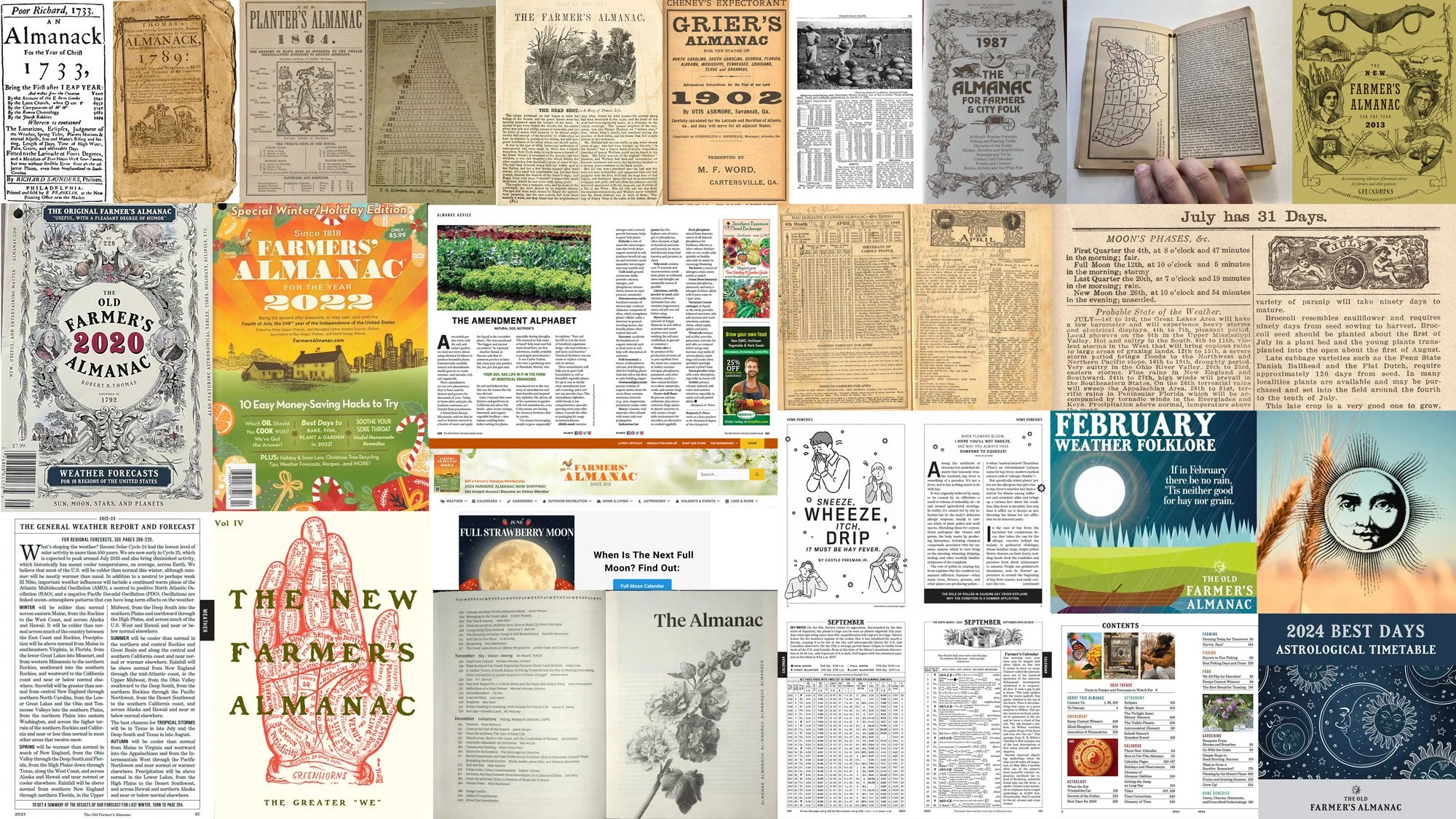
The first step was researching historical and current farmer’s almanac publications. Almanacs have been popular for hundreds of years in the United States and have mass appeal as a source of reference and entertainment. However, pain points for today’s progressive, urban audience include lack of cultural inclusivity, text-heavy content, crowded layout, and lack of practical appeal for readers who live in small spaces.
-
![photos of four readers of the magazine. each shows the reader, some writing, and a collection of lifestyle images]()
2. Reader Personas
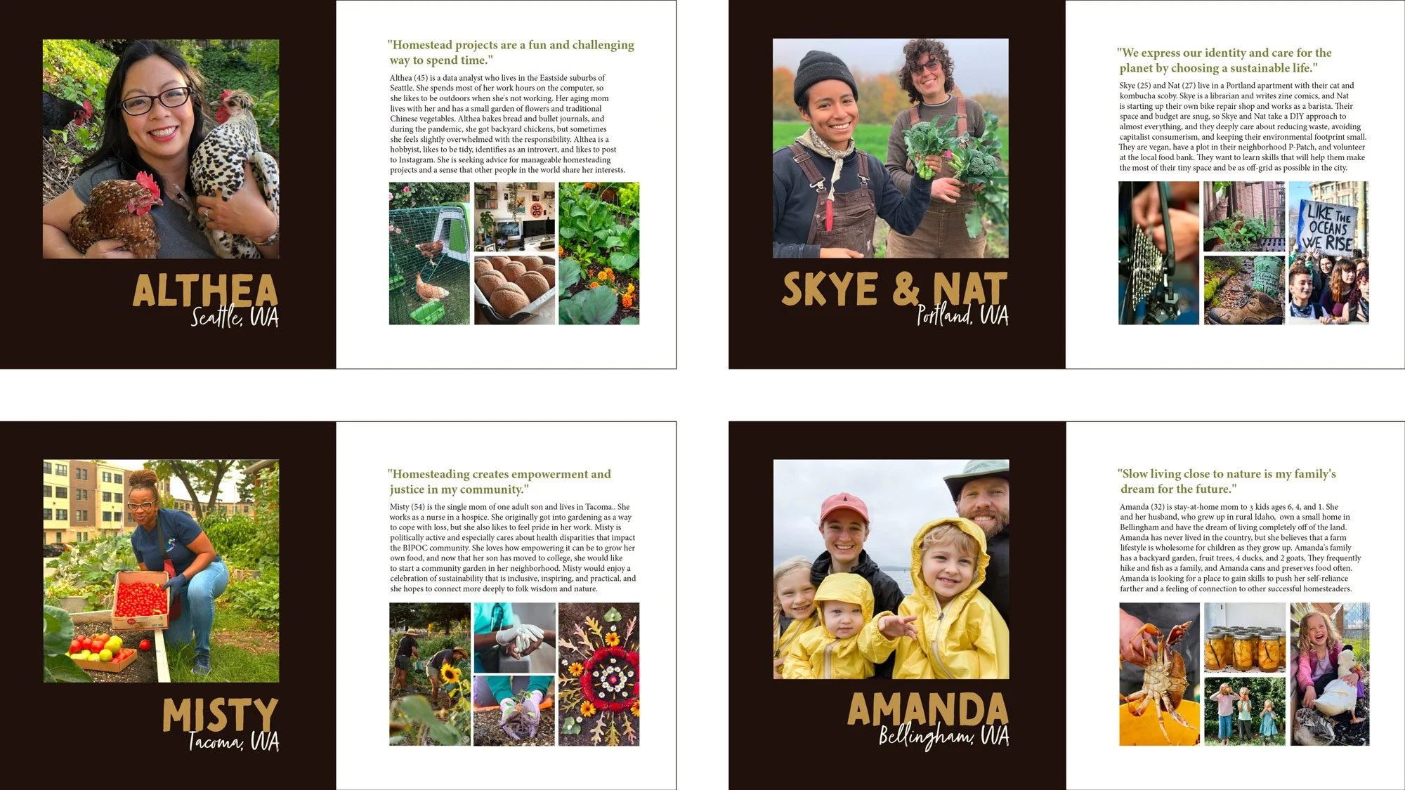
To help understand and empathize with the magazine’s audience, I developed four reader personas, each embodying different motivations, interests, and viewpoints of Abundance’s desired customer base of urban and suburban homesteading enthusiasts.
-
![selection of photos showing photography, illustration, and layout arranged in columns]()
3. Initial Mood Board
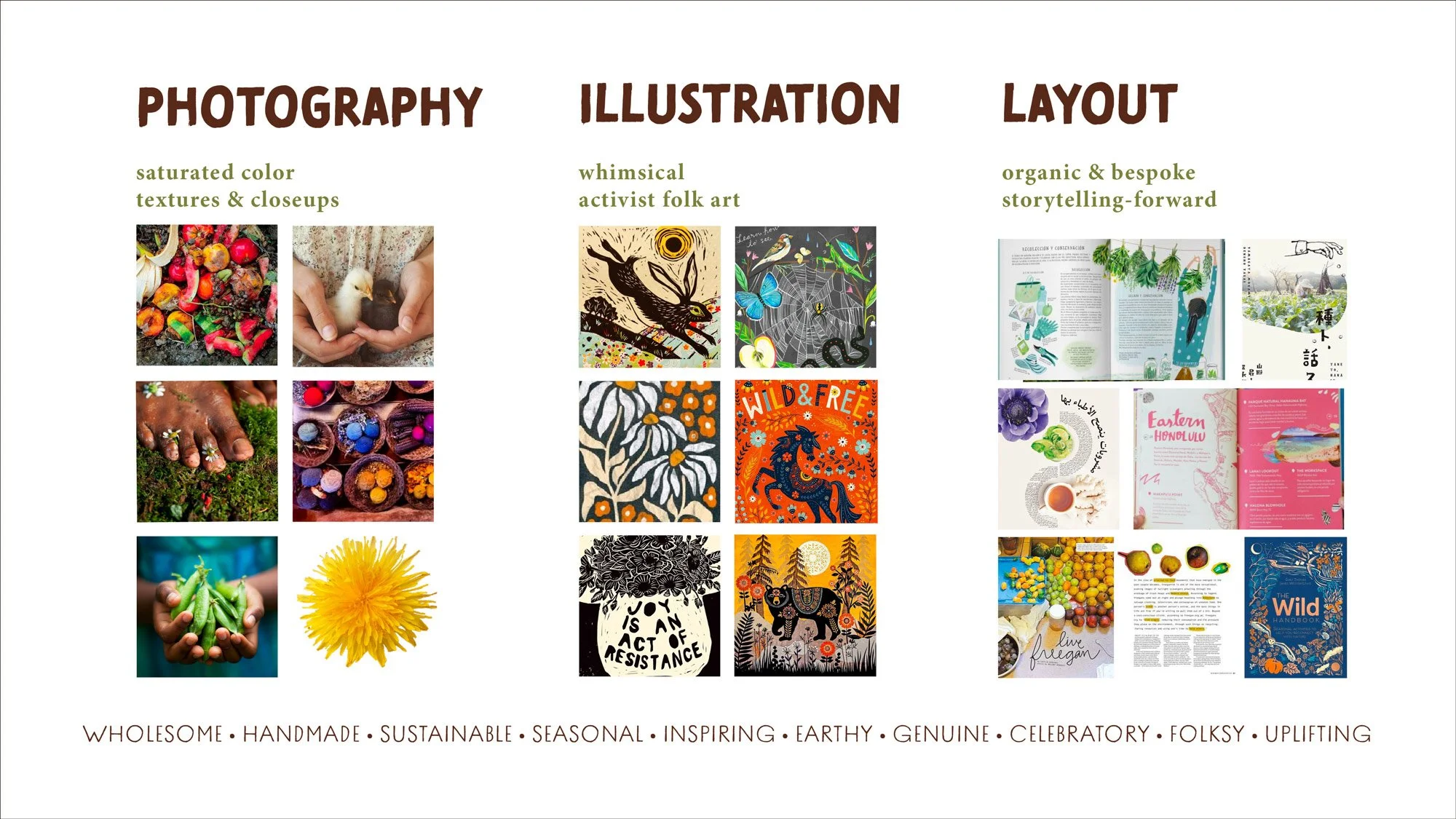
The initial mood board had a maximalist, whimsical, folk-art inspired character with dense illustration and text. Although the photography in this mood board was successful, the illustration and layout styles did not produce spreads that were a match for the audience and content, so this mood board was replaced shortly after layout work began.
-
![vibrant collage-style mood board including photography, illustration, layout, type, and colors]()
4. Final Mood Board
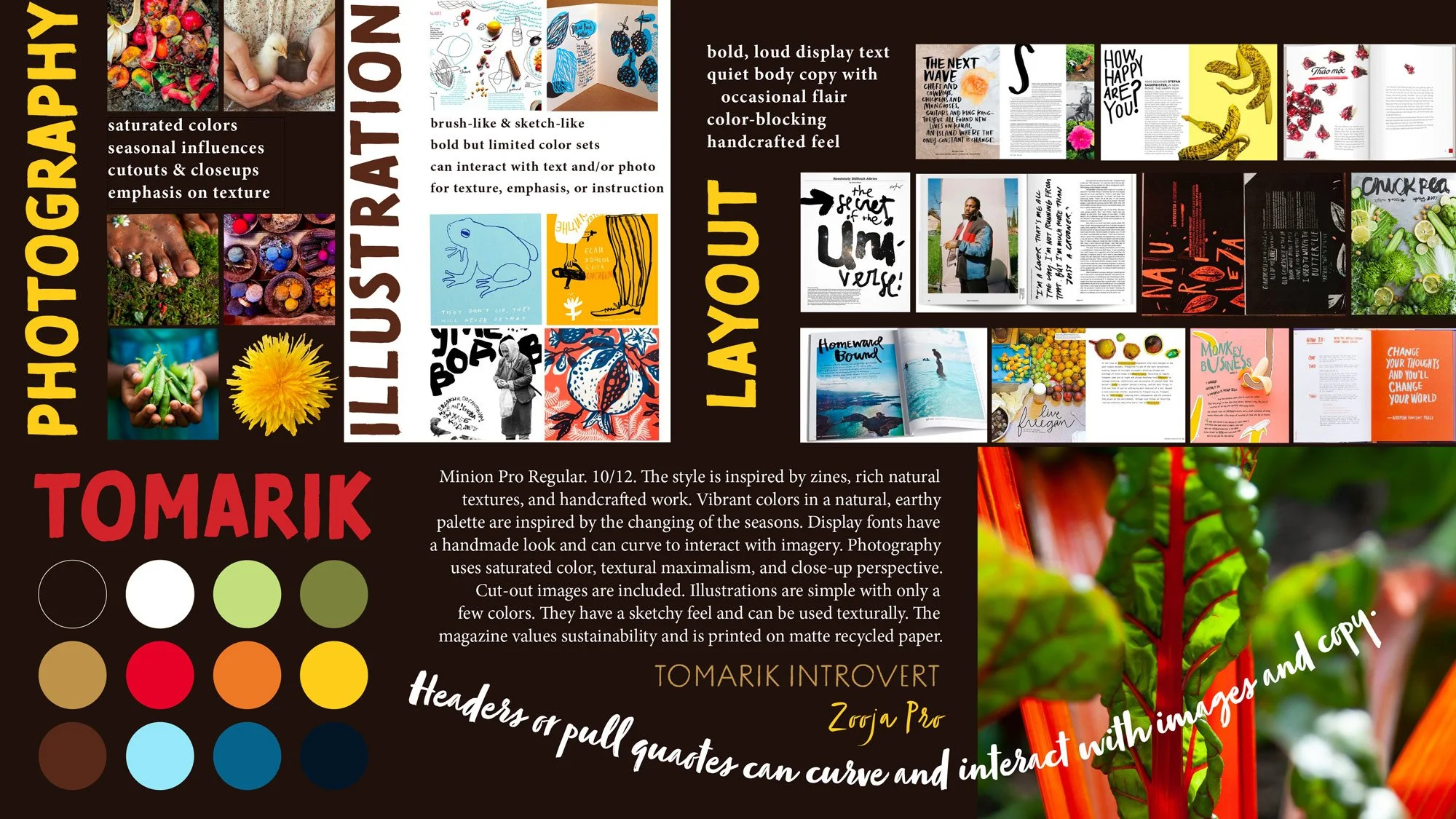
After realizing that the initial mood board was not working, I updated the vision for illustration and layout in this reworked mood board. The magazine’s new direction has a more lively, urban feel while keeping its commitment to a hand-touched and nature-centered aesthetic. During this stage, I also chose typography and set the initial direction for the color palette.
-
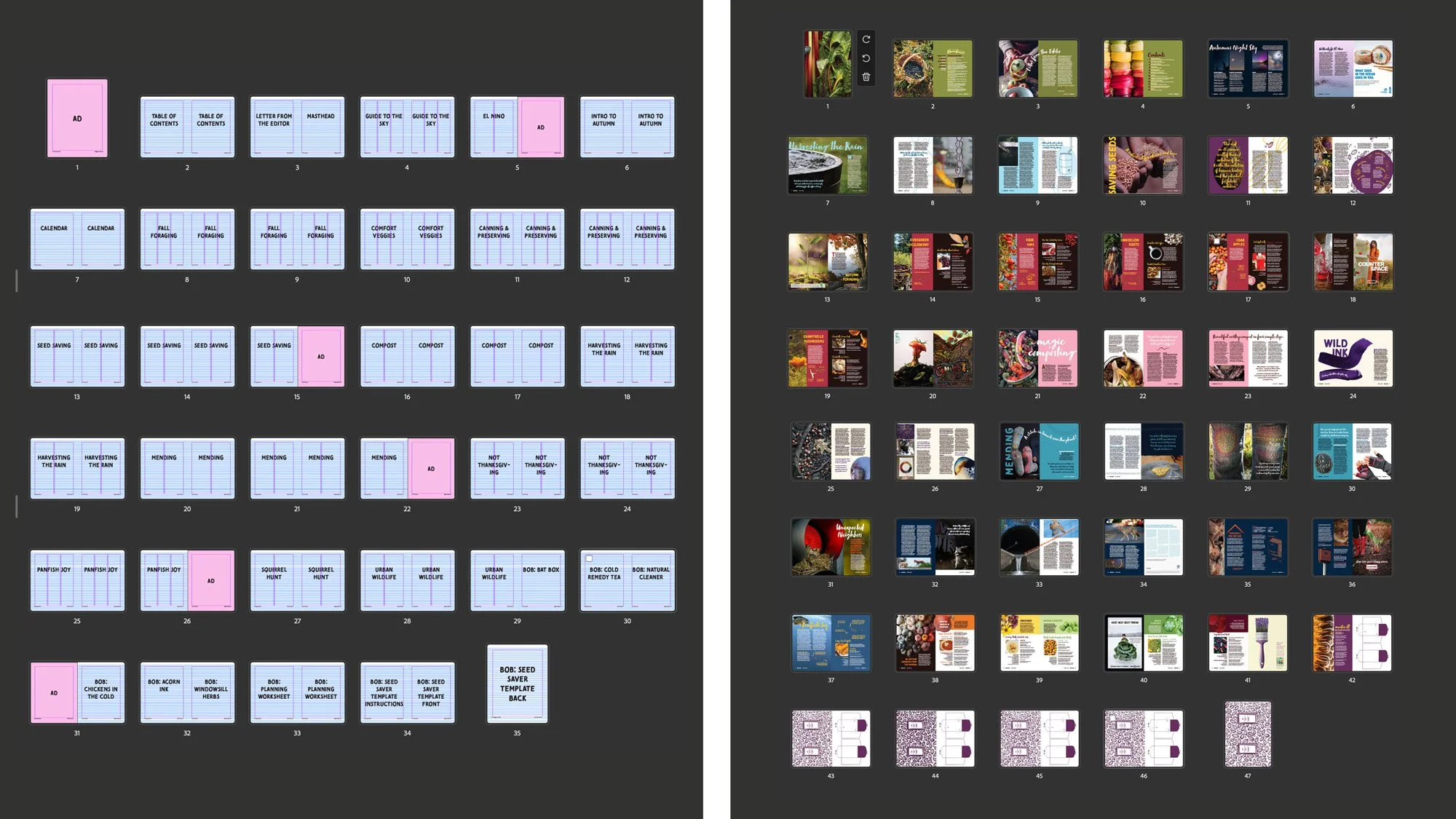
![two sets of thumbnail-size images of magazine pages, one set that's blank and the other with images and text filled in]()
5. Flatplan
Once content was selected, I created the initial flatplan, then began the process of laying out each spread. During the process, changes occurred to improve the visual experience, to create a better flow of information from article to article, to add pages as a resource for the do-it-at-home craft, and to make room for additional advertisers.